This summer I sent in an application to intern with the folks at the fantastic Data Science for Social Good program. Unfortunately (for me definitely, for them possibly) my application was not successful, but I did learn some cool facts while looking around their github repos. I want to focus in on the DSSG Data Challenge Improving the Effectiveness of Publicly-funded Energy Efficiency Programs by Identifying Target Areas and Buildings with the Greatest Need.
As far as introductions go, the title pretty much says it all. Different homes across Chicago all use energy (electric/gas), some more efficiently than others. The question of energy efficiency is of course relevant to society as a whole, but may be a particularly pressing issue for poorer neighborhoods that spend a good chunk of their income on keeping the house warm and the lights on. So the idea behind this challenge is to identify neighborhoods where a retrofitting effort would be maximally impactful. Of course "impactful" isn't a specific quantifiable outcome. All other things being equal, it would be nice to improve total efficiency. But it should also be important to note that small efficiency gains in poorer neighborhoods could have a bigger payoff in terms of social good than modest improvement in random neighborhoods.
With these ideas in mind, I sought out to try to get a sense for overall energy consumption across Chicago by downloading and analyzing some relevant data. A full account of my exploration, including links to the data, can be found in the following IJulia notebook which can be viewed here and forked here.
When working with new datasets about things you have a rough intuition about, its oftentimes a good idea to check for the obvious, which is the first thing I set out to do. The following shows a scatter plot of average per capita income and the percent of the population below the poverty level, grouped by neighborhood:
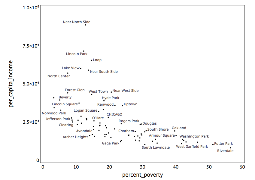
Unsurprisingly, we see that some kind of income inequality exists. For those that know Chicago it should also come as no surprise that the Near North Side is near the top of the per capita income (probably the average household income is in the six figure range). Hyde Park is roughly in the middle of the income spread. Washington Park has both low average per capita income and a high fraction of the population in poverty. It is important to note that there are significant fraction of the population living below the poverty level even in high average income areas, which hints at the fact that there is heterogeneity within neighborhoods. I think there are lots of interesting things to look at here (feel free to download the data and take a look!), but we should get on the problem of energy use.
The data I was able to find on energy use has all kinds of fields, but the most basic quantities of interest are the total population in a census block, the average square footage of a house where people live in (it's important to filter out empty houses), and the energy usage of each block, which include electrical usage (kwh) and gas (therms). I then grouped these census block level statistics according to their neighborhoods, which allowed me to make a basic comparison between socioeconomic indicators and energy usage. For example, here's a scatter block of gas efficiency against average income and percent poverty:
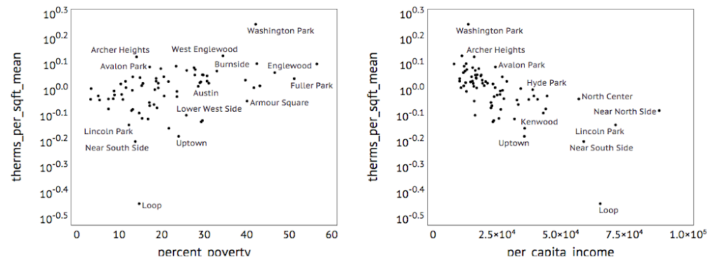
It is clear that there is indeed quite a bit of spread in energy efficiency, with the efficient Loop neighborhood (this is downtown, with skyscrapers and all) outperforming Washington park by nearly a factor of ten. How much of this variation can be explained in terms of of socioeconomic inequality is a more difficult question (which I won't try to answer here), but it does seem that there is a trend of increasing efficiency with increasing average income. There are more detailed questions that one can ask about this dataset (some of which I look into in the notebook linked above). For example, poorer neighborhoods tend to have more people living in the same household, so that even if the buildings are inefficient on a room by room basis, they appear efficient on a per capita basis. It is also true that the wealthiest communities tend to have a lot of new buildings, which might tend to increases their efficiency (there is information on building ages in the linked dataset for those who are interested). It is also interesting to think about how gas usage might differ from electrical eficiency. Just for fun, here is a scatter plot comparing the two, with the points shaded according to the fraction of the population below living below the poverty level:
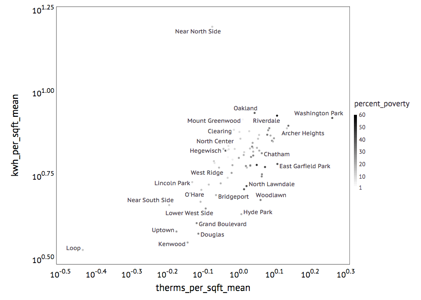
Again the Loop is super efficient on all accounts. There is a clear correlation between gas and electricity efficiency in the bulk of the distribution. Something weird is going on with Near North side electricity efficiency (Get Donald Trump on the phone!).
Okay, ignoring that for the moment, the other things that pops out to me (yes, that is a completely unscientific pattern identification) are the three dark dots at the top of the bulk of the distribution identifying the Oakland, Riverdale and Washington Park communities. These are communities with high poverty and low energy efficiency. Perhaps they would make good targets for a retrofitting program? It's definitely worth looking into but there are tens of thousands of people in these neighborhoods, so we should probably try to constrain our analysis a bit more. With that thought in mind I thought to get a sense for the spread of efficiency within these communities by returning to the the census block level data and comparing the distribution of efficiencies in these communities to the rest of Chicago. The result is shown below:
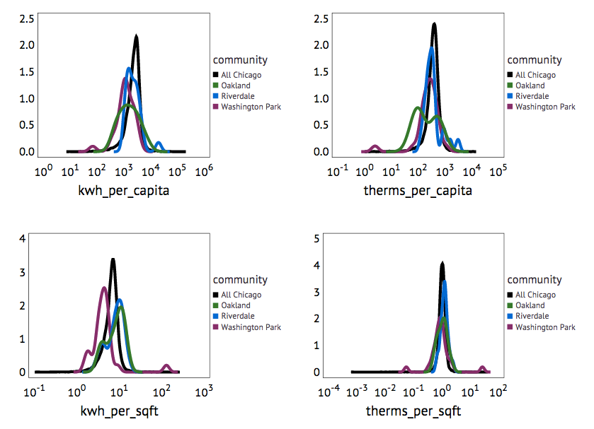
The x axes show efficiencies normalized on a per square foot as well as a per capita basis. Interestingly, it seem to me that (with the possible exception of Oakland) these neighborhoods are capable of efficient gas usage compared to the rest of Chicago, even though the average efficiencies are lower. This suggests that retrofitting for improved gas heating would need to look in detail at the houses to move forward. In contrast there seems to be significant differences in electricity efficiency beyond the average. The profiles really look different. I don't have much to say beyond that, although I would be curious to see how much of the trend could be explained by housing usage patterns (like how many people live in a house, how often are rooms vacant, how well are they maintained, etc.). Feel free to fork the notebook on github or start your own analyses if you find this interesting.
No comments:
Post a Comment